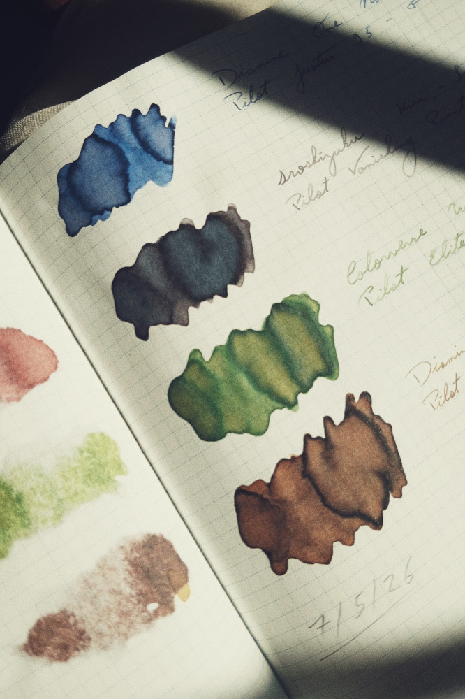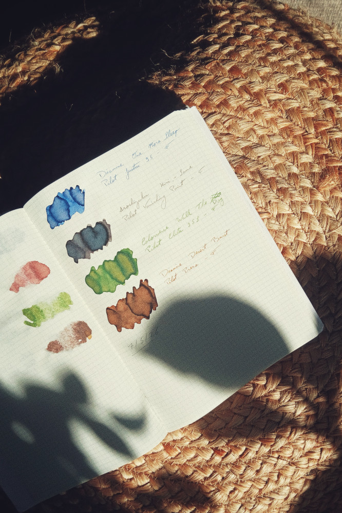
It was early May, my fountain pens were running low on ink, and I fancied a change. I had attended the Bath Pen Meet at the end of April and tried a Pilot Prera. I had been carefully avoiding purchasing it, but from the moment this pen touched the paper with its glorious F nib, I knew I was doomed.
So, in celebration of the Pilot Prera landing in my house soon after the pen meet, I decided for an all Pilot rotation. It is (in my somewhat limited experience) impossible to go wrong with Pilot pens. All of mine have been delights from the start and continue to be so.
Two inks I knew I wanted in my rotation. Two I picked afterwards to harmonise with the others. I debated on which ink for which pen for far too long and ended up leaving the decision to my brother.
First up Diamine One More Sleep. I had purchased this ink back in November but hadn't had the opportunity to use it. It was time to rectify this. Out of the ink drawer and into the Pilot Justus 95 it went. This pen has mostly been inked with Rhorer & Klingner Salix since coming into my possession. I was feeling like a change, if only not to get bored of the pairing. I was set on not filling it up with blue but here we are. My brother chose this pairing so I had no choice, obviously.
One More Sleep is one of the few inks I fell in love with from the only Inkvent calendar I ever sampled. I was first drawn to it but could not figure out why. It's a blue ink. I'm not a blue ink person (well aside from when it comes to the Pilot Justus 95 apparently). Only it's not quite a blue ink. It carries hints of lavender when it dries that makes it a little more complex than first appear. It's a soothing ink, an ink full of the early flowers of Spring, and I love using it at this time of year when bluebells fill the woods.
This ink I knew I wanted to use. Pilot Iroshizuku Kiri-Same was love at first sight. Unfortunately for me, the moment I discovered this ink was the moment Pilot announced they would discontinue it. I dithered a long time about purchasing a bottle of it. Irozshizuku inks are expensive in the UK. In the end, I purchased it in France during a short visit to Lyon. It was still expensive but now it was a favourite ink and a memory of a trip all combined in one.
My brother picked the Pilot Vanishing Point for this one. This pen was an early one and a bit of gamble given its Marmite status online. For me, it was love (just like with Marmite). I originally had a medium nib in it but swapped it for a fine nib as my tastes took shape and settled firmly in the finer side of nibs.
The pairing is wonderful. A wet ink in a wet nib. It flows and glides and makes notetaking at work a little better, and it has to be said, a little distracting as I watch the ink pool and dry on the cheap office paper.
This ink is a perfect companion to Diamine One More Sleep. The pale pinkish grey compliments the pale purplish blue to perfection. Spring flowers and spring skies on the page.
PS: the swatch for this one surprised me. For some reason, the colours separated a lot with the pink settling at the bottom.
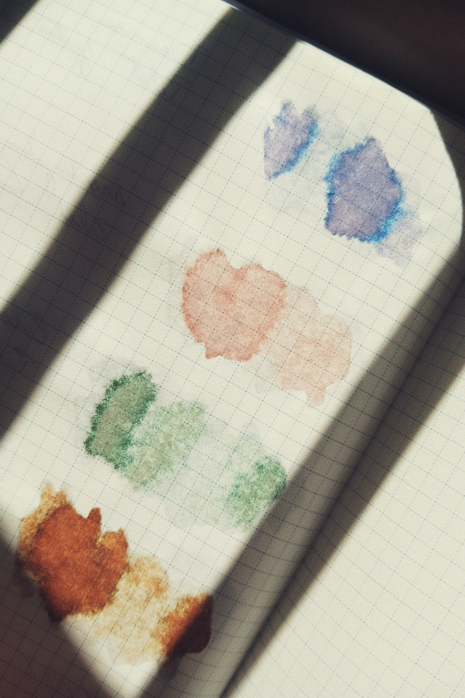
Colorverse is not a brand I use often. They release a lot of shimmer inks which I do not care for, and they release a lot of inks in sets (at least they used to. I have somewhat dropped off the release bandwagon the last few years). Amongst their starry themes, they also released a series called 'Joy in the Ordinary'. It comprises of small bottles of standard inks with scenes of every day life and they are beautifully whimsical.
Walk The Dog is a wet green, bright and grassy that makes me think of sunshine and lazy days dozing and reading in the garden. It is not so very far from my beloved Rhorer & Klingner Alt-Goldgrün, but it is a little wetter, a little yellower.
My brother picked the Pilot Elite 95S for ink. It is a pen I adore. I took a long time over the purchase decision and I do not regret it. For years, it was my sensory diary pen, faithfully inked with Rhorer & Klingner Scabiosa. I used it nearly every day but then long covid came, my life changed, and my sensory diary turned into a burden rather than a joy, so I stopped keeping it and parked the pen. This was unfortunate for the pen, but I needed some distance to stop associating the pen with one ink, with one purpose. I'm glad I did. The green ink is not a great match for it but the nib is pure joy and that keeps me coming back to it.
Finally, the pen that started the idea of this rotation: the small and mighty Pilot Prera. I knew I wanted a brown ink to complete this set of ink. I first selected the bright yet mellow Diamine Honey Burst but that was a bad move. It wouldn't have been in any of the above pen, but my brother picked the finest of fine nibs for a light coloured ink (not that he was aware. I just sent him photos of the bottles), so I swapped for Diamine Desert Burst pretty soon after first inking the pen. This is a much better match.
Desert Burst is a lovely dusty brown, soft and with a touch of something older. I often gravitate towards the dark earthy browns of winter when it comes to brown inks, but for this time of year, something lighter was in order. The pen and ink are a fantastic pairing that makes writing effortless. I can run across the page to the sound of feedback and the precision of a fine point. It is going to be difficult to put the Prera away when the ink runs out.